.jpg)

A website that tries to welcome everyone tends to connect with no one. Decide exactly who your studio is for, name their real worries, and answer them directly on the page.
bsport research with 550 fitness members across Europe and the US found that 1 in 5 will walk away from a studio if the booking process feels complicated or unclear. A clear "Book a class" button, visible without scrolling, protects that 20%.
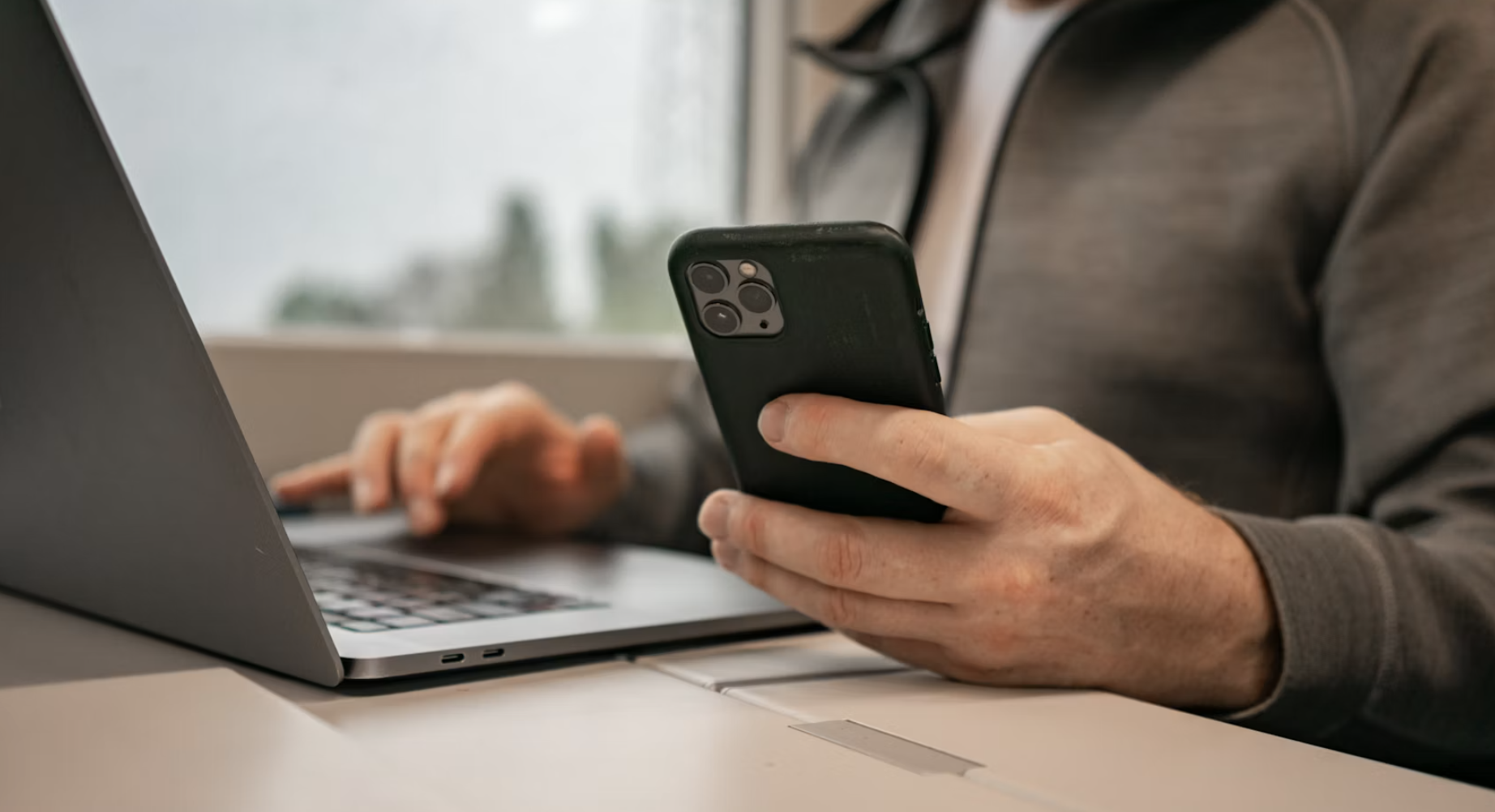
bsport's redesigned branded app lets new visitors browse your schedule and class details without creating an account, and only asks them to sign up once they're ready to book. It carries your branding and removes friction at the moment someone decides to commit.
Your studio website is the first impression most new members ever get, and it is quietly deciding whether they book or click away. That was the starting point of our very first bsport Power Break, a 30-minute session on how to build a fitness studio website your members actually want in 2026. Web designer Lara Galka, founder of Studio OAX, who works with boutique fitness studios on branding and design, walked through what visitors expect, where they get stuck, and the small changes that make booking feel obvious. Nicole Rodriguez, product manager for member experience at bsport, then showed what happens after someone taps “Book a class,” and how our redesigned branded app keeps that next step simple.
Here is what studio operators can put to work straight away, whether you run one independent studio or a growing franchise.
Your website exists to connect the right people with your studio
The real job of a studio website is to connect the right person with the right studio, and to gently filter out the people you are not trying to reach. Owners often worry about leaving anyone out, so they default to messaging like “everyone welcome.” A site that speaks to everyone rarely speaks to anyone.
Your audience shapes everything: how you structure the site, what you say, and the tone you say it in. Lara suggested three questions to answer before you build:
- Who are you trying to connect with? Look at what surrounds your studio. Young parents nearby? Office workers dropping in at lunch or after work? That picture defines your audience.
- What do they need to understand? That you have exactly what they are looking for. Speak to their specific worry and offer a solution. For young parents, that might be stroller-friendly classes or childcare on site. For an office crowd, showers and free towels after a session.
- Does your site guide them to the next step? The whole point is a booking, so every word should move someone toward it.
Want more tips? Watch the full Power Break recording.
Answer every question before a visitor has to ask it
Think of your website as your digital storefront. Anticipate the questions a first-time visitor has, and answer them on the page. This also helps you show up in search and AI-generated answers, since clear, structured content is easier for people and engines to read.
The questions that matter most:
- Where are you located? Location is still one of the biggest reasons people pick a studio. Make it easy to find you, mention parking, and consider embedding a Google Maps widget.
- Which class should I choose? Be specific. Describe the experience so people know what they are walking into. A gap between expectation and reality is the fastest way to lose a first-timer.
- How much does it cost? Show your prices clearly, including tiers and the savings on larger credit packs or longer memberships. You don’t have to compete on price if you can show why your studio is worth it.
- Is there an intro offer? New visitors rarely sign up for a long membership on day one. Something simple, like three classes at an attractive price, gives them a low-risk way in. Highlight it on your pricing page, and consider a banner or a homepage callout too.
- Will I connect with the teachers? Your site is where your instructors’ personalities can come through. Write personal, descriptive bios so people can find the teacher they relate to.
- How do I book? This should never be a question a visitor has to ask. The “Book a class” button is the most important call to action on your site, and it belongs above the fold, visible the moment someone lands.
Where booking friction creeps in
bsport surveyed 550 fitness members across Europe and the US. 1 in 5 said a complicated or unclear booking process is enough to stop them trying a studio. That is 20% of potential members lost before they even start. Lara pointed to three places friction tends to hide:
- Clarity: crowded pages are hard to scan. Get to the point and answer the questions people actually have. Be specific about class types and levels so nobody arrives with the wrong expectation.
- The booking journey: there should be one obvious route to book. A “Try” button that leads to a contact form, or a schedule buried three menus deep, sends people away. The button should take them straight to the schedule, and the schedule should make booking simple. This is the thinking behind bsport’s scheduling and booking tools.
- Brand consistency: keep your logo, colors, typography, and tone of voice consistent across your physical studio, your website, and your social media. When all of them feel like one brand, people trust it.
Lara shared before-and-after examples from real studios. One site hid its schedule under an “Information” menu with no way to actually book. A stronger example kept a “Book a class” button both on the page and pinned to the top as visitors scrolled, with schedule, pricing, and classes front and center in the menu, and a banner promoting a two-week new-member offer.
The three layers of a website that converts
Lara framed a strong site as three layers working together:
- Point of view: what your studio stands for and why anyone should care. You control every word, so make the site unmistakably yours in look, feel, and language.
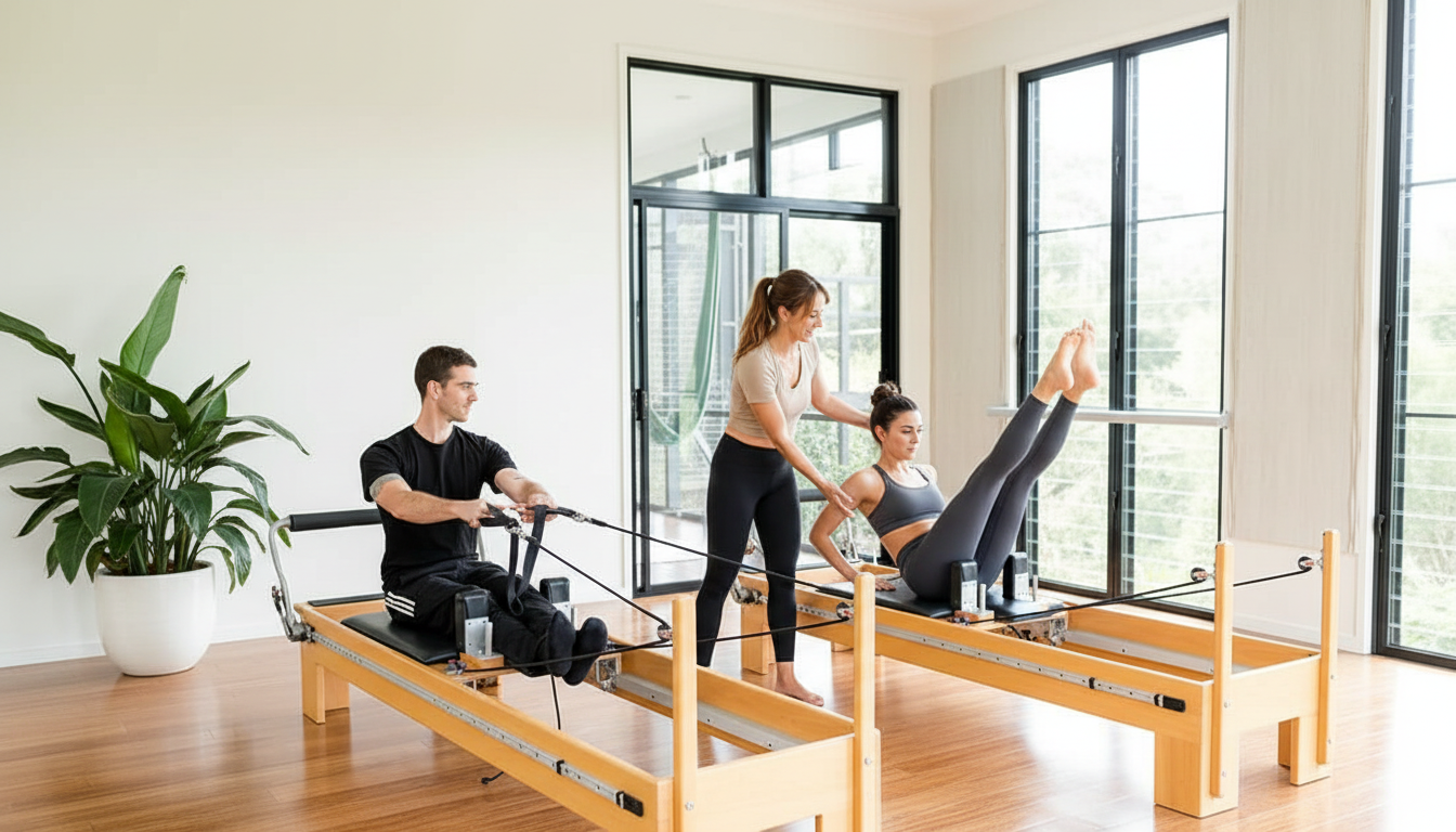
- Communication: whether that idea comes through clearly and consistently. A calm reformer Pilates studio might use muted, earthy tones, classic fonts, and plenty of white space. An upbeat spin studio might go bold, with bright colors, energetic imagery, and language like “Fitness is boring. We deserve better.” The words set the expectation before anyone walks in.
- Execution: whether someone can actually find what they need and book. Every unnecessary step is a chance to lose them.
What happens after someone taps “book”
A great website gets someone to the point of booking. What happens next matters just as much. Nicole Rodriguez shared how bsport’s redesigned branded member app applies the same thinking to the moment of commitment.
- Consistent branding throughout. The app carries your colors and logo across the whole experience, so your brand follows members from your website straight into the app.
- Explore without an account. New visitors can now browse the home screen, your schedule, and class details without signing up. They are only asked to log in or create an account when they show clear intent to book, which removes a common drop-off point for people who aren’t ready yet.
- A homepage that adapts. The new home screen changes for new versus returning members. Newcomers are guided to explore the schedule and discover your studio. Returning members get quick access to rebook a favorite class or add a guest to an existing booking.
Your website checklist
The clearest theme across both halves of the session: every step should make the next one feel simple, from a visitor’s first impression to their confirmed booking. Run your own site through this list:
- A clear “Book a class” button above the fold, leading straight to your schedule
- Schedule, pricing, and classes easy to find in the menu
- Prices and tiers shown openly, with the savings made obvious
- An intro offer that gives first-timers a low-risk way in
- Personal, descriptive instructor bios
- Location, parking, and a map
- One consistent brand across your studio, website, and app
Take the next step
If your booking journey has more friction than you’d like, that is exactly what bsport is built to remove, from your website booking widget through to a branded app your members enjoy using. See how the branded member app can carry your brand from first click to confirmed booking, or book a demo to walk through it with our team.